When you have become God's in the measure he desires, then he himself will bestow you upon others, unless, to your greater glory, he choose to keep you all to himself.
—Saint Basil the Great
«— Beautiful Websites Will Save the World
—» The Cross is a Time Machine (and It’s Bigger on the Inside)
November 26, 2013
PO;DR—Pop-over; Didn’t Read.
Link to this post
 Pop-overs. Those annoying advertisements, requests for information, and alerts that appear over a web page, obscuring its content. Developers call them modal windows. I call them “the reason that I immediately close that tab or window.” The only way that this annoying virus will stop is if the organizations that are doing it realize that it is killing their bottom line.
If you are as infuriated as I am, join me in closing that tab or window without any further action. Then tell the people in charge via email, Twitter, Facebook, body tattoo, or whatever floats your boat: “PO;DR”—pop-over; didn’t read.

What people are saying about this article: Comments Off on PO;DR—Pop-over; Didn’t Read.
«— Hatteras-style Clam Chowder
—» PO;DR—Pop-over; Didn’t Read.
September 27, 2013
Beautiful Websites Will Save the World
Link to this post
A dear classmate of mine wrote me today to ask for examples of good parish website design—the “best to examine for style, layout, information and the most welcoming to the non-Orthodox.” My reply was short on examples, but long on some fundamental design principles. I wondered if maybe I had not really answered the question my friend asked. In concluding, I realized why I think these principles are so important: I have seen too many bad parish websites. Getting a parish website right is not optional. It is a pastoral and evangelical necessity. Here is my reply to my friend (edited for style and content):
Read the rest of “Beautiful Websites Will Save the World”
What people are saying about this article: Comments Off on Beautiful Websites Will Save the World
«— The Gospel vs. H.R. 4437
—» Male activists want to opt-out of unplanned pregnancies
March 3, 2006
Online Survey for OCA Website
Link to this post
«— The Great Fast Approaches
—» On Change and Changelessness
March 1, 2006
Pet Peeve: “Click Here” Links
Link to this post
“For more information, click here.” Where does this link go? Well, in this case, that link goes straight to hell. Actually, hell.com. The “click here” link is about the most useless way of providing text for a hyperlink. It tells me absolutely nothing about what’s going to happen when I activate it. Is my computer going to blow up? Am I going to be asked to register for some service? All I know is that the web author wants me to click it.
In this category for exactly the same reason is the “this page” or “this site” or “this post” link. It means, roughly, “click here.” Vacuous and useless.
Web authors, please stop. Tell me more information, so I know if that’s a web page I want to load before I activate your link. Also, this makes web search engines like Google work way better.
«— Are You a Heretic?
—» Orthodox Christians for Accountability
January 17, 2006
Broken iTunes UI in 6.0.2
Link to this post
 I’ve always thought it cool to broadcast my current song selections to anyone and everyone, so the MiniStore controversy meme currently raging in the blogosphere rates less than a 0.1 on my GAS-o-meter, especially since the broadcast can be disabled easily. What does bother me is a fundamental borking of the user interface.
iTunes’ UI is designed to look like a music player, whether CD, DAT, or cassette tape. Up until 6.0.2, the controls acted like music players, too. The reverse control, when operated once, reset the current track to its beginning; operated twice, it reset the current track to the beginning of the previous track. With 6.0.2, this simple, intuitive behavior is degraded if you’re listening to a podcast. Reverse changes the current track to the previous track. Forward or double-click on the track you were listening to takes you to the position last played in that track/podcast, unless the track is marked as unplayed, in which case it starts at the beginning.
Unclear? Reverse — the back, the two triangles pointing to the left, or your left arrow key — used to take you back to the start of the current podcast. Now, it takes you back to the start of the previous podcast.
This is an improvement, I suppose, if you’re a moron. For the rest of us, this breaks a consistent and intuitive expectation of music player user interfaces — one that is met by nearly every other software music player on the market.
If I were the guy who suggested this UI change, I’d be embarassed that someone took my suggestion seriously, when I thought it was clear that I’d had one too many shots of Jaegermeister. If I were the superior who took this suggestion seriously, I’d be making sure my résumé were in order.
On the other hand, this has the stink of Jobs all over it.
What people are saying about this article: Comments Off on Broken iTunes UI in 6.0.2
«— Interpreting the OCA Advisory
—» We All Dream, When We’re Younger
March 7, 2005
Accessibility and Usability Forgotten at OCA.org
Link to this post
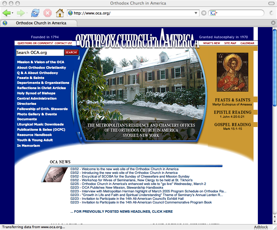
The recent redesign of the Orthodox Church in America website represents a step forward only in ease of administration for the webmaster. Any critique will necessarily be skewed with subjective bias, but web design is not entirely a subjective field. On nearly every question of usability and accessibility, the new OCA website fails.
Read the rest of “Accessibility and Usability Forgotten at OCA.org”
«— Firefox and Nutscrape
—» Accessibility and Usability Forgotten at OCA.org
Interpreting the OCA Advisory
Link to this post
In a recent article, I mentioned that the new OCA website was visually borken in Firefox on Macintosh platforms. I also promised a site critique. I still hope to publish an article critiquing the new site, but further exploration of the site has proven that such a critique will be a massive undertaking. Though tempted to despair of the utility of such an exercise, I am undaunted.
As I plan what I will write, I was pointed to an “advisory” from the OCA webmaster. Does this make sense to you? “We broke your links to our site. Stop whining and fix your website. We’re more important than you.”
Typical scenario 1: An inquirer looking for information about the Orthodox Church types in “orthodox church history america” in Google. After looking at the top few links which inaccurately skew the history of American Orthodoxy toward Hellenic Orthodoxy, he goes to click links to the OCA website that look promising. What does he get? A very unhelpful default IIS 404 page. The OCA webmaster’s answer to this inquirer? “Stop whining and fix your links.” Right. He’ll probably just get his information from the Greeks or the Antiochians. If he’s persistent, he’ll look at other pages that link to the same two pages on the OCA website. And he’ll keep getting the same 404 errors.
Typical scencario 2: A faithful Orthodox Christian uses the OCA’s daily readings and hymns in her daily rule of prayer. Using her handy bookmarklet to get today’s readings, she finds the default 404 page. Not only unhelpful, it interrupts her spiritual exercises, breaking her concentration and forcing her to find out what’s gone wrong. The OCA webmaster’s response to this Orthodox pilgrim? “Stop whining and fix your links.” That’s beyond inexcusable.
Will Google spider again and update its links? Of course. Will other websites change their broken links? Some will, many will not. “I am the OCA.org webmaster! Change your links before me, for I am….” Let me be the first to assure you, you are deluded.
 A while ago I also wrote about “The Biggest Design Mistakes of 2004.” This is the top mistake: Believing People Care About You and Your Website.
Write these two sentences where you can see them as you’re working on your computer:
- The only reason my web site exists is to solve my customers’ problems.
- What problems does the page I’m looking at solve?
Nobody cares about you or your site. Really. What visitors care about is getting their problems solved.
Why is that number one? Because it’s the most important part. The site is not about the webmaster, it’s about the users. Piss off your users, and at best your website will be irrelevant.
«— New and Unimproved
—» Interpreting the OCA Advisory
March 5, 2005
Firefox and Nutscrape
Link to this post
How Stuff Works is featuring an article on Firefox explaining some of its superior features such as extensions and pop-up blocking.
Also in Firefox news, Netscape 8 beta was released today. Screenshots reveal a hideously unusable interface. Unsurprisingly, it is only being released on Windows platforms. Mac users don’t go for blecherous interfaces. (Well, sometimes they do; but they’re spoiled by the goodness of the Mac interface, so it’s less likely.)
«— With All My Voice
—» Firefox and Nutscrape
March 3, 2005
New and Unimproved
Link to this post
 Yesterday, the Orthodox Church in America broke its website. The page displays poorly in Firefox, Mozilla and Netscape, whose shared rendering engine makes up 25% percent of the browser market according to W3 Schools. Old links, such as the link to my home parish’s information and the bookmarklets I use every day, have been broken.
When you redesign a site, your first priority should be that your existing users continue to have a positive user experience. This means creating redirects for moved pages and testing your new design against a wide variety of browsers. A redesign that alienated 25% of your users would get you fired in any corporation that valued its web presence (or at least moved to a position in customer service). I see no reason to be kinder simply because this is a non-profit. In fact, since this is my church, I feel obligated to be forthright.
I will perform a more thorough site critique later, but early impressions are highly unfavorable.
«— Mutterings for February 27
—» Creation, Part VI: Conclusion
February 28, 2005
Raskin Leaves Legacy to Usability
Link to this post
MacMinute News and Slashdot report the death of Jef Raskin, who helped pioneer the creation of the Macintosh in the mid-80’s. Raskin was also the author of The Humane Interface, an important text in usability (which I had on my Amazon wish list at one time). Joy of Tech is also featuring a tribute to his memory.
«— Horn, One’s Own, Tooting
—» USS Jimmy Carter (SSN 23) Commissioned
February 18, 2005
Learning from Others’ Mistakes
Link to this post
If you design websites, read “The Biggest Web Design Mistakes of 2004.” Vincent Flanders’ “Web Pages That Suck” brilliantly exposed some of the greatest annoyances of early web design. This latest article reminded me several times of annoyances I’ve had very recently, especially with one particular website.
Hat tip: Web Standards BUZZ.
What people are saying about this article: Comments Off on Learning from Others’ Mistakes
«— To Havdala
—» Cthulhu for President
August 26, 2004
Transparency: Better Than Annoyance
Link to this post
<rant>
Some of WordPress‘s features to control spam in comment and discussion areas trip you out. Unfortunately, some annoy you till dead.
Requiring my email address tops my list of annoying bugs features purporting to limit comment spam. I already get tons of gooey, sticky email spam in my Inbox; I want to limit what I get in the future, thank you. Only my closest friends and associates need my email address, and most of them already know it. If they do not, they can use my handy-dandy email form to email me. If I think them worthy of a reply, then — bingo! — they have my email address. Requiring me to reveal my address annoys me when I know the owner of the blog and frightens me when I do not. Once you have my address, what exactly do you plan to do with it?
Adding to the obvious privacy issue, one must ask: What exactly is requiring an email address supposed to do? I find just as many spam attempts with email addresses as without. Additionally, legitimate comments from readers wishing not to give me their address are usually worth it. (See the privacy issue in the previous paragraph.) Plus, it usually seems not to matter if a fake address is provided, like stop.requiring@this.silly.info.
Another annoying bug feature is holding all comments in a queue until they are moderated. This is not nearly as bad as the previous feature, but it slows down conversations. Some of the best conversations in blogspace explode in seconds. Good insights can be lost when a moderator loses track of time. This is especially the case on a blog like mine, where sometimes days elapse before I get a chance to moderate.
The best spam killer is holding comments in a moderation queue if they match certain conditions. There are two ways WordPress checks for conditions that look like spam:
- more than five links in a comment
- words on a disallow list are present (cialis, tramadol, paxil, your pet-peeve–word)
These catch nearly all the spam I ever get. If I start getting spam with a new word, I go back and delete the comments (very easily done with WP’s new comment moderation interface), and I add the word to my no-no–list. Easy, and transparent to users. Transparency++
</rant>
«— Not Much of a Leap
—» Interpreting Saint Maximus
July 3, 2004
Shocking
Link to this post
Did I just read Tim blog positively about tabbed browsing in Firefox?
In other news, I think I just saw Satan ice-skate to work.
What people are saying about this article: Comments Off on Shocking
«— Petra Anastasis
—» How Do You Say…
October 25, 2003
Holiday Googles
Link to this post
 I’ve been looking recently at the past Holiday Googles. Very spiffy. It is really quite interesting to see the development in their style from the beginning — five years ago — until now. Some of the “Google Doodles,” serial Googles that usually tell a story, are pretty fun. My favorite is the Dilbert Doodle. I’m trying to decide if we can pull off holiday stuff with the wordmark on the parish website.
What people are saying about this article: Comments Off on Holiday Googles
«— I Don’t Know Why…
—» The Foomobile Rides Again
October 3, 2002
Tweaking…
Link to this post
After corresponding with Hixie about an unrelated matter, I decided to rework the site and remove as many unnecessary div and span tags as I could. I’m sure that the ones I left Hixie would still think unnecessary, but at least I’m satisfied for the night. It was downright embarassing before, especially in light of my earlier rants on the subject.
To emphasize what has been said elsewhere, div and span tags should be used sparingly and only when no other tag will do. Currently, they are often abused in much (X)HTML. There were places before the great sword Revision approached that I found things like:
<div class="foo"><h3>Augustus Caesar Omnibus Exultavit</h3></div>
No lie. I am so shocked and embarassed. Of course, it’s really all Michael’s fault. 🙂
Update: I do not feel nearly so bad now. Looking at Hixie’s site, I note many div and span tags. Mostly done where they are truly necessary. But I did note this interesting bit of code:
<span class="pingback">
<a href="http://example.com/index.php?reallyLongQueryString" title="Cute Name for a Referrer">1</a>
</span>
I feel so validated now, I can’t tell you. 🙂
What people are saying about this article: Comments Off on Tweaking…
Copyright © 2002–2011 Kevin Robert (Basil) Fritts, all rights reserved.