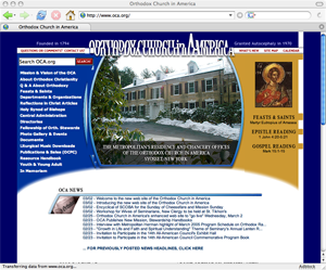
New and Unimproved
Warning: Undefined property: linknotes::$are_links in /var/www/vhosts/basil/kbsite/blog/wp-content/plugins/linknotes.php on line 73
 Yesterday, the Orthodox Church in America broke its website. The page displays poorly in Firefox, Mozilla and Netscape, whose shared rendering engine makes up 25% percent of the browser market according to W3 Schools. Old links, such as the link to my home parish’s information and the bookmarklets I use every day, have been broken.
When you redesign a site, your first priority should be that your existing users continue to have a positive user experience. This means creating redirects for moved pages and testing your new design against a wide variety of browsers. A redesign that alienated 25% of your users would get you fired in any corporation that valued its web presence (or at least moved to a position in customer service). I see no reason to be kinder simply because this is a non-profit. In fact, since this is my church, I feel obligated to be forthright.
I will perform a more thorough site critique later, but early impressions are highly unfavorable.
