Brand Failure
Warning: Undefined property: linknotes::$are_links in /var/www/vhosts/basil/kbsite/blog/wp-content/plugins/linknotes.php on line 73
 Several years ago, British Petroleum (BP) completely changed their branding. They stopped using a recognizable, if uncreative, shield emblazoned with “BP” which was readily identified as their trademark. They shifted to an unrecognizable poly-shape — what is it? a flower? a starburst? an explosion? (Good association for an oil corporation, that last one.) It seemed less creative, and no one ever identified the new branding scheme with the product: British Petroleum (or, more precisely, BP gas stations). It has been a decade since this branding shift, designed to imply that the company is green. Apparently, the image of BP as green has worked.
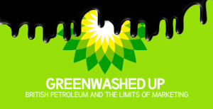
The brand still fails, however: Foreign Policy’s image of the multi-foliate jabberwocky becoming covered in oil did not immediately bring to my mind associations of BP until I had laboriously read through the text of the advert.
And this is before we get to the damning text of FP’s article. Green is the new black, apparently.
